


There are situations in trading when there is no need to study the price movement in detail. Sometimes, it is more important to determine a trend. A line chart is an excellent tool for this purpose.
This article will tell you in which cases a line chart is used, whether you can build it yourself, and what the risks are when using this type of chart.
If you want to learn even more about charts, you can read the Full guide to trading charts.
Main specifics and features of line chart
Charts are essential for trading any instrument. They allow you to see how much a share or a currency pair costs and how their value has changed over the day, month, etc.
Graphical information is the result of scanning the market, on the basis of which traders can make trading decisions. For example, to open a long position when an asset is likely to go up or sell it if a decrease in quotes is expected.
Most traders who are taking their first steps in the world of trading use line charts as it is simple.
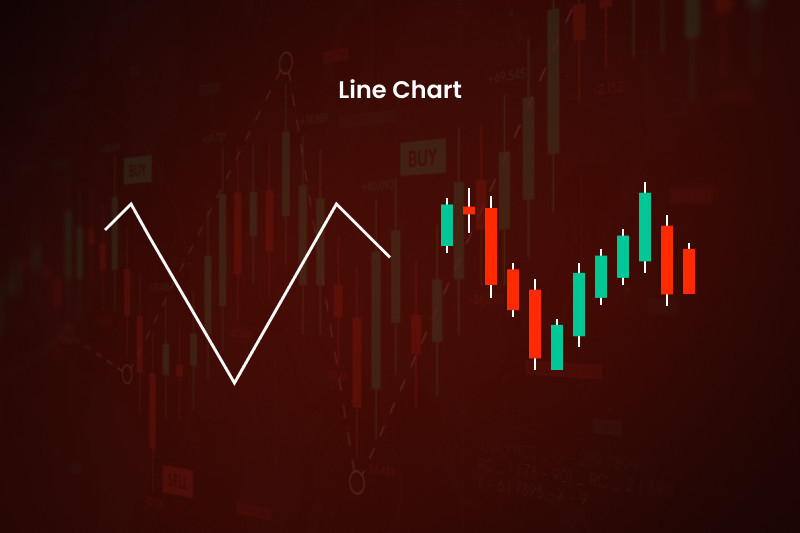
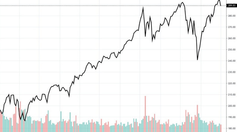
Visually, it represents a curve that connects price levels. The horizontal axis is the time, and the vertical one is the value of the asset.
In most cases, only closing prices are fixed. According to Charles Dow's theory, this indicator is the most important one that reflects the true nature of the market.
Although many critics do not agree with this statement and believe that this indicator is not enough for the analysis of price action and implementation of trading strategies.
At the same time, traders are allowed to choose. For example, you can set up the use of highs or lows, as well as the open prices to build the line chart.
Another possible option is to set the average values between the highs and lows.
However, only one of the above setups will be used. This is the main difference between line charts and bar or candlestick charts.
While each Japanese candlestick or bar contains 4 types of data about the value of an asset on a time frame, the line is based on a single indicator. As we have already said, the closing price is most often used.
At first sight, this seems to be a significant disadvantage.
However, this disadvantage also has its benefits. Due to the filtration of market noise, you get the final result of price changes, disregarding the intermediate data.
The problem of market noise is especially important for short-term trading strategies.
Features of line charts:
- Bound to time. Unlike tick charts, line charts are linked to the timeline, that is, even if the price does not change, the chart continues to move;
- Easy perception. Even at first glance you can assess the existing market situation and determine the trend;
- Simple reading and analysis;
- Versatility in terms of time frames and assets. This type of chart can be used for trading on different markets, for analyzing price changes of different financial instruments;
- Absence of an abundance of data, so the chart is not overloaded. It simplifies the process of determining the direction of the dynamics and constructing the Support and Resistance levels;
- Quick display in trading platforms and analytical platforms. Usually, these charts are loaded faster than candlestick and bar charts;
- Minimization of market noise received from lower periods. For example, if the closing value is used, all other indicators are ignored;
- Smoothing of false breakouts, which warns the trader against making wrong decisions;
- Access to historical data, which helps to identify global trends and patterns.
All of the above characteristics point to the advantages of line charts. However, they also have weak sides:
- Line charts do not inform about price gaps. Gaps are simply not visible as the line is always continuous. If there was a gap, the trader can only guess about it by observing a sharp change in the price trajectory;
- They do not provide an opportunity to analyze the highs and lows in a certain period. That is, traders get no data about what was the highest and lowest price of the asset;
- They do not allow traders to analyze the price change within the time frame. For example, if an M5 time frame is used, a trader will not know how the price changed at the end of each minute;
- It is used more often for analyzing historical data than for making long-term forecasts. We will tell you why a little later;
- Line charts can generate false signals if traders use lower time frames. Notably, this applies to all types of charts, so it is worth checking the signals on higher time frames;
- Provide data on only one asset. Most platforms do not provide composite charts, so it is necessary to open different charts to analyze different assets.
At the same time, line charts do not always consist of one line. The above chart can also be multilinear or composite.
This type implies displaying several variables on the vertical axis. An example would be a chart showing the changes in two or three assets within the same time frame.
Where to apply
We have already mentioned that a line chart is a universal tool. First of all, we are talking about different categories of traders who can use them.
There are no strict requirements for the experience and skill of a trader and a chosen strategy. Line charts can be used by both beginners and professional traders, as well as short-term, medium-term, and long-term traders.
In addition, this type of chart can be used when working with different assets, i.e. financial instruments.
1. Forex. Patterns are identified on a line chart, also Support and Resistance levels are drawn;
2. Cryptocurrencies. When trading digital assets, the above type is used mainly by scalpers who use lower time frames.
As for longer-term strategies, the use of line charts is not justified due to the high volatility of digital coins;
3. Securities. A line chart allows you to analyze the prices of stocks, and bonds and build forecasts on their basis.
As a rule, this option is used in the stock markets as an additional tool because it does not contain all the information about the price of the asset. It is also used by beginners for training and learning the basics of pricing on stock exchanges.
Thus, line charts can accompany trading on different platforms. The presence in all trading platforms is another advantage.
That is, if you want to use a line chart, you will not have to install plug-ins or perform other actions to add it to your trading platform. The vast majority of software developers allow traders to use this type of chart by default.
Meanwhile, line charts are not very effective for testing strategies. In most cases, they do not contain the data needed to test the effectiveness of a trading strategy.
When using the chart, it is important to follow these principles:
- The higher the time frame, the more global and stronger the identified trend;
- Chart patterns give more reliable signals for longer periods;
- On higher time frames, reversals or continuations patterns will last longer than if they were happening on lower time frames.
How to read line chart
As practice shows, even beginners do not find it difficult to analyze a line chart as it is quite simply built.
Let's assume that the trader has chosen an hourly time frame. When this period ends, a point appears on the chart.
We have already mentioned that it is the value of the asset at the time of closing that is most often used. Therefore, the required height corresponding to the price at the end of the period is plotted on the Y-axis.
When another hour passes, a new point appears. The result is a line that connects all these points.
As a result, traders can evaluate the current situation in the market. Namely, to see in what direction the price changes and what is the volatility of the asset.
It is important to consider the fact that the graphical information provided is not complete. For example, if lines are plotted based on closing prices, a trader does not know what the value was at the time of opening, and how the quotes changed within the period.
That is why it is reasonable to use line charts to evaluate general market sentiments and determine the prevailing trend. It is worth using bar or candlestick charts for a more detailed examination of price data and making trading decisions.
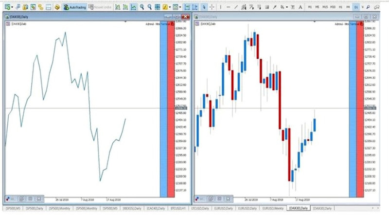
This screenshot shows two types of charts of the same asset on the same time frame. Even at first glance, it is clear that the line chart is inferior to the Japanese candlestick chart in terms of data representation.
On a line chart, a trader can:
- Determine a trend;
- Draw support and resistance levels;
- Identify chart patterns;
- Analyze trading volumes;
- Draw moving averages.
Functions of line chart
This type of chart is really helpful. First, it does not require any special knowledge or effort to draw it. Second, it filters out market noise.
At the same time, it smoothes out the extremes that are important in trading. Thus, traders get only a general picture, and its essence and history remain unknown.
Each line can contain a lot of data. They could be useful in trading, but by using only lines, traders are deprived of the opportunity to use them.
Taking into account these features, line charts have the following functions:
- Analysis of the market situation over a long period. In this case, traders do not really care about short-term price movements, the main thing is to get a brief overview;
- Simplification of drawing trend lines, identifying patterns, etc.;
- Less market noise in the picture;
- Assisting beginner traders in mastering financial markets and testing trading strategies;
- Making long-term forecasts. This point is very controversial as experts have different opinions about this.
Some experts believe that a line chart can be used for prediction by using patterns, levels, etc.
Other experts believe that other types of charts (candlesticks, bars) are better suited for this purpose. A line chart is better used only for a quick evaluation of the market.
Analysis using line chart
We already told you that a line chart can be used as a tool for analysis. It is not a perfect option but it still can be helpful.
There are several ways to analyze and predict price changes using a line chart.
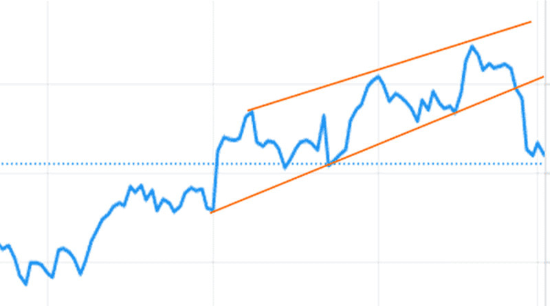
1. The use of graphical patterns. Identification of a pattern helps to suggest a further vector of change in the value of assets and choose the best moment to open a position.
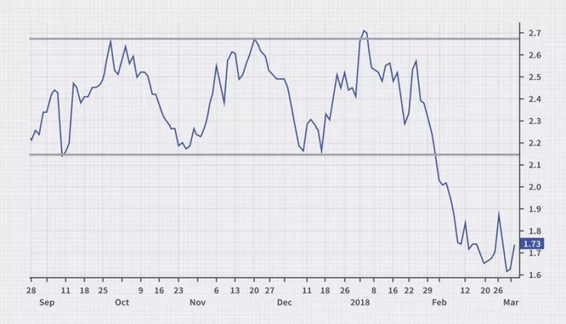
The screenshot shows the dynamics of the EUR/USD pair at a given timeframe H4. The ascending channel pattern is identified on the chart. This pattern most often signals an upcoming reversal of a bullish trend.
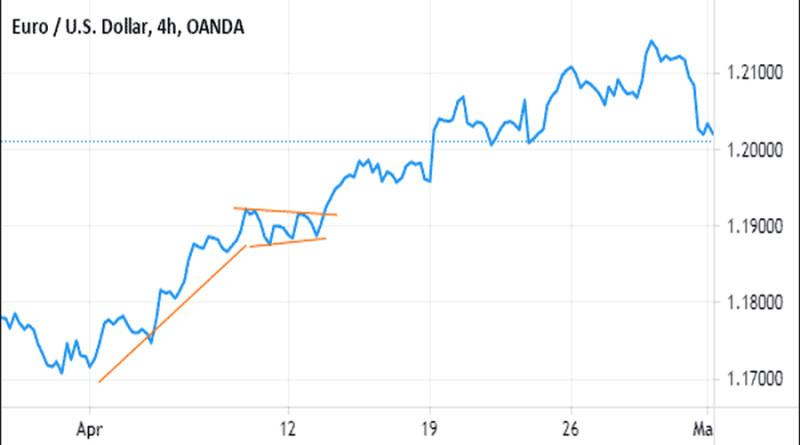
In addition to all varieties of channels, you can also try to find the Flag, Pennant, and other patterns on the line chart. An example of the second pattern is shown in the screenshot.
Here we are talking about an ascending pattern, which warns the user that after consolidation inside of it, the price will continue to move along the previous trend;
At the same time, not all of the existing patterns can be identified on the line charts. For example, it may be difficult to determine the Head & Shoulders pattern, as well as the Hammer, and Engulfing candlestick patterns.
As a result, important trading signals will be missed, which will negatively affect trading performance;
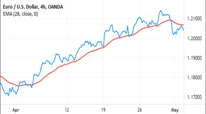
2. Moving averages are most often used to confirm price changes. If the price curve passes above the rising Moving Average curve, it means that the trend is bullish, and if it moves below the descending MA line, the trend is bearish.
The screenshot shows the crossing, after which the growing trend reverses;
All of the above tools are basic. At the beginning of the trading path, they may be enough, but experienced traders will need others.
Sometimes, they cannot be applied to line charts, so you have to use other types of charts.
How to create line charts
The principle of building line charts is quite simple, even a novice trader can cope with it. It requires the following:
- Select an asset. Here we are talking about a financial instrument (securities, currency pairs), that the trader is going to use to make a profit;
- Choose a time frame. Depending on the strategy used, this can be one minute, a week, or a month. It depends on a chosen strategy;
- Get data about the closing prices for each time frame. For example, if a trader chooses the M5 time frame, it is necessary to use the price of the asset, fixed at the end of each 5 minutes;
- Fix the area between the horizontal and vertical axes of the obtained data. The X-axis is time and the Y-axis is price;
- Connect the points with a line. The result will be a curve, which will be a line chart.
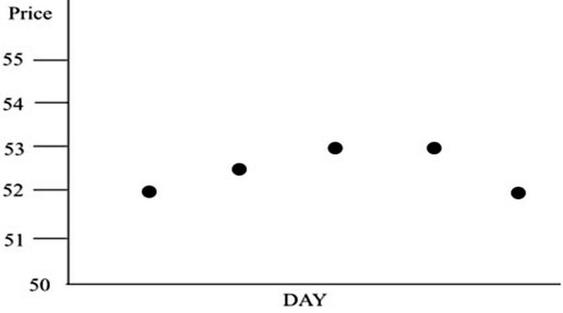
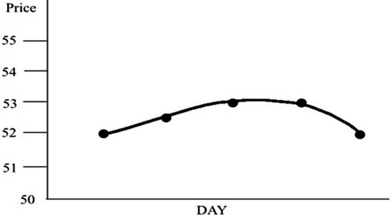
Here is a concrete example. Let's assume that we use shares of conditional company A as an asset, and we choose a daily period.
On Monday, the closing price was 52. On Tuesday, it was 52.5, on Wednesday and Thursday, it was 53, and on Friday, it was 52 again.
Apply these data to the chart, as shown in the screenshot.
After that, connect all the points with a single line. It can be either broken or smoothed. This is up to the user.
As a result, you get a line chart. This is a very schematic example, but it reveals the essence of how this type of chart is built.
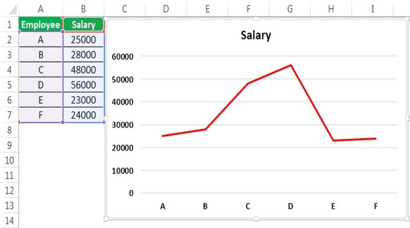
You can use special software to make it easier for you to build a line chart. For example, some traders do it using Microsoft Excel or Google Sheets.
To show how it works, let's give an example and create a chart showing different salary levels for a group of employees. We will use Excel to do this.
The first thing to do is to open the table and fill it out, i.e. enter the necessary data. Column A contains the employees' data (we will use the letters A, B, C, D, E, and F instead of full names), and column B contains the salary amount.
When all the cells you need are filled in, select all of them, including the names. In the Insert menu, click the Chart button, then select the image of the line.
As a result, we will get the image shown in the screenshot.
The employees are on the X-axis, and the salary is on the Y-axis.
You can edit the data through the Chart Design tab. You can change the data, captions, colors, etc.
Linear charts for trading are built the same way. Column A in this case you will need to enter the time frame (minute, hour, etc.), and column B should contain the closing prices.
If you need to compare changes in the prices of two assets, i.e. to build a composite chart, more cells will need to be filled. Accordingly, in the Insert section, you will need to select a multi-line chart, not a simple one.
Where to get ready-made line chart
In trading, as in many other spheres, efficiency is very important. That's why traders do not build charts themselves but use those created by specialists.
Thus, they simultaneously solve several problems:
- Save time and resources. It is not only about constructing but also about collecting necessary statistical data about asset prices;
- Use precise information in their work;
- Increase the effectiveness of trading by optimizing their work;
- Quickly change time frames in ready-made charts and use charts of several assets in trading.
You can find ready-to-use line charts:
- in trading platforms;
- on websites of brokerage companies;
- on analytical and informational websites.
Let us consider each variant in more detail.
1. Trading platforms. As a rule, the developers of trading software provide several types of charts.
Bar, candlestick, and line charts are the most popular, so they are built into almost every platform. For example, in MetaTrader 4 and 5.
Notably, MT4 allows you to trade currency pairs only, while MT5 allows you to trade futures, and securities as well. Another difference is the number of time frames.
MT4 has 9 of them, while MT5 has 21.
The charts in the fifth and fourth versions do not differ in any way, the principle of their construction is also similar (closing prices are used). On the horizontal axis, the time scale is located and prices are on the vertical one.
In MT4 and MT5, it is possible to open a large number of charts on the screen and adjust them. The settings imply the change of color, scale, etc.
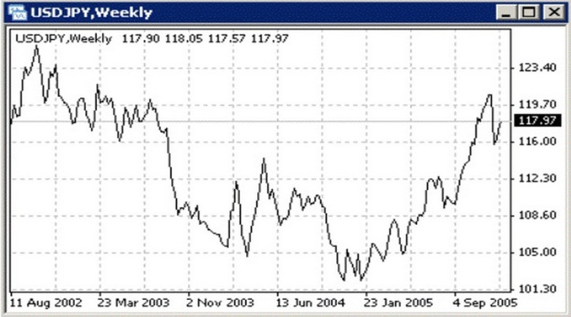
Alt: Line Chart in MT4 Terminal
You can set up a line chart in MetaTrader 4 in different ways:
- Click the button with the line image in the Chart tab;
- Press Alt+3;
- Open the Chart Properties window and select the necessary option from the list;
- Using the main menu, execute the Charts - Line command.
2. Websites of brokers. As a rule, brokers offer charts of all available trading instruments.
For example, InstaForex has over 300 of them. These are currencies including digital currencies, metals, securities, stock indexes, and futures.
You can find an asset of a certain group and choose the most popular one out of all existing ones. Also, InstaForex provides an opportunity to download an archive of quotes.

If you select a specific instrument, the system will provide information not only about the current rate but also information about its dynamics. In addition, information on the advisability of buying or selling based on traders' opinions will appear in the window.
For traders wishing to learn as much as possible about the chosen instrument, information on factors influencing the quotations is presented;
3. Analytical and information portals. This group includes TradingView, Investing.com, and other websites.
The trader may use them to:
- get live charts of currency pairs, shares, and other assets;
- read expert reviews on investing in one or another instrument;
- get access to the archive data on prices;
- apply tools for analysis;
- study fundamental factors that can affect the price of an asset.
As surveys of traders show, in most cases, the information from the charts located on the platforms is enough for trading. Additional options are used to test new indicators, and strategies, as well as to check incoming signals.
Features of use
There are situations when traders have so much information when analyzing the value of a trading instrument that they are unable to use all of it. This can happen for several reasons:
- A trader is working with a large number of assets at the same time;
- A trader uses too many indicators;
- Novice traders cannot quickly navigate the chart, and the constantly changing market situation confuses them even more.
There is even such notion in trading - "analysis paralysis." Its essence is that due to an abundance of signals and data, a trader simply cannot concentrate on the most important data and make the right trading decision.
If the reason for this is a chart, then the use of line charts can be a way out of the analysis paralysis. This option will help to assess general market trends, identify the trend, determine the support and resistance areas, and identify trading patterns.
Simply put, it can be used to perform the simplest technical analysis of an asset's value, without the need to use an array of data.
This type of chart is optimal for beginners. They can be used to master basic chart reading skills to subsequently move on to studying more complex charts such as Japanese candlesticks, bars, and tick charts.
It is not advisable to use only line charts in trading. First of all, they do not contain all the information necessary for making trading decisions.
Moreover, some strategies cannot be tested and implemented, if only a line chart is used. Some strategies involve the analysis of not only closing prices but also other indicators, which are absent on the line chart.
That's why traders use this type of chart to assess general trends. For a more detailed analysis and to find entry and exit points, they resort to the help of bar or candlestick charts.
Conclusion
If you are new to trading and want to understand the nuances of market trends, a line chart is your choice. Using it, you will be able to assess the market situation, understand in which direction the price is moving, and which price levels are important.
This type of chart is not overloaded with information, it is simple to use and easy to read.
However, you should not exaggerate its importance in further trading. As you gain experience, a line chart is better to use as an additional tool but not the main one.
Because of the lack of a complete set of data in this chart, you risk missing important trading signals and opportunities to gain profits.
One more important nuance is that there is no ideal chart for all traders without exception. Those who prioritize simplicity prefer line charts, while those who prioritize a full set of data prefer bar, tick, and candlestick charts.
You may also like
How to read stock charts
How to read investment charts
How to read a stock action
How to read graphs
Best indicators for 1 minute chart
How to read a candlesticks chart
Japanese candlestick chart
Candlestick chart


